Sunday, 7 July 2013

Political Puddings

It has been a good while since I've updated this blog that I was supposed to update frequently.

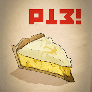
Before I was due to leave for Hong Kong, I began a series of quick, crudely photoshopped drawings entitled, 'Political Puddings'.

I am going to make a conscious effort to continue these as frequently as possible and spend a little bit more time on them; more detail, better line and little descriptions.

Here are the first two in the series. See if you can guess what they're called. I'll find out if you 'right click and save as' for the answer, so be warned!


Mark.

Saturday, 26 January 2013

Starscream Update

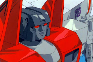
Having ran into some sort of 'designer's block' with regards to Starscreams face texture, I rendered out a front view of Colour and Ambient Occ for the face and helmet (the face was just a grey mia x material), then set them up in Photoshop to be painted over. I'm pretty happy with the way he turned out; it's now time to go back into Maya to restructure the face and add in the neck geometry. 

Any feedback would be greatly appreciated (especially any tips or suggestions for rendering settings and materials).


Mark.

Tuesday, 22 January 2013

Starscream Project

Growing up in the 80's, Transformers was to kids what cocaine was to lawyers - explosive and expensive quick fixes that were paid for by our parents.

Every character from the Generation 1 era became instant household names. With characters as charismatic and as memorable as Starscream, The Dinobots, The Constructicons, Optimus Prime, Megatron and Soundwave, not even Orson Welles' famous defamatory statement, 'I play a big toy who attacks a bunch of smaller toys'  could put a damper on our relationship with Transformers...probably because a.) He was pretty much correct, and b.) At the age of 6: who was Orson Welles? He didn't sound like a very interesting Transformer anyway.

We all know what happened with Michael Bay and Transformers, which is a shame because the concept art for a lot of the character designs looked incredible; a lot more akin to the solid, sleek and strong silhouettes of the original series than the convoluted, ugly 90's esque 'cool sharp shapes' of the final designs. God, even Optimus Prime had a flame tattoo. He may aswell have textured on a f***ing 8-ball and gave him a wallet chain.

Anyhow, the point in this post is that I've decided to model a selection of Transformers, keeping close to the G1 designs but textured and lit realistically. I stumbled upon an amazing 'Devastator' fan-piece that is exactly how he should have been re-imagined for the film and is a constant source of inspiration for this project. You'll find it in the images below.

First on the list is Starscream. The Colour Map is almost complete. I'll start on the Bump and Specular very soon then begin a few rendering tests before moving onto his face.

If you have any feedback, ideas or suggestions then feel free to post or email.

Hope you enjoy.


Mark.

Monday, 22 October 2012

Welcome to Prime Time, Bilbo!

If there's one thing I love more than Nightmare on Elm Street, it's Lord of the Rings. And if there's one thing I love more than Lord of the Rings, it's Robert Englund.

Let's be honest now - we all love Krueger more than the actual Nightmare films. Sure, for all its shortcomings and flagrant technical ineptitude (midget stunt- Freddy, anyone?), the original was creative, imaginative and still makes for brilliant viewing...but then all the other parts happened. Although, in all fairness, 'Dream Warriors' deserves to have its name uttered (not too loudly, though).

It took the whole concept of Freddy and the workings of subconscious closer to, what I reckon, was buried deep under the original's vicious surface - that I approve of. Dream manipulation and subconscious powers were fleshed out admirably in 'Dream Warriors', albiet rather fantastical and amateurish. However, the beginnings of Krueger's puns, one-liners and bad stand-up routine, coupled with his absurd and convoluted back story, were elements that really weren't necessary.

Anyway, what if Freddy haunted the LOTR universe? Firstly, I tell you what - it would probably be less absurd than Hellraiser: Bloodlines and Jason X. Secondly, it would be rather entertaining and certainly have more integrity and intensity than the Nightmare re-boot.

My poster design isn't based on any of the Nightmare or LOTR posters. The moment I remembered the bridge going into Helms Deep, it screamed out to be Freddy's arm. I had originally planned to craft Krueger's claw from rocks and cracks, but a friend suggested that I use soldiers. I'm glad he did, because it works well. I consciously chose those insipid greens and striking red to remain as close as possible to Freddy's colour scheme.


Mark.

Thursday, 11 October 2012

'Rhymes for Swines' at Pleasefund.us

The funding page for my project 'Rhymes for Swines' is now online at PleaseFund.us.

It's an illustrated book of 20 - 23 rhymes about  love, death, stalkers and killers. (Think Roald Dahl and De Sade squashed together in a word press).

lease spare a few minutes to have a look at the video and incentives, it would be much appreciated. If you could pledge some money towards the project then that would be even better. Regardless of either, though, you can click the 'LOVE IT' button. It's free, takes a second and helps spread the word about the project :)

http://www.pleasefund.us/projects/rhymes-for-swines

http://www.facebook.com/RhymesForSwines

https://twitter.com/rhymesforswines

http://rhymesforswines.co.uk/


Mark.


Another Gig Poster

Here's my latest poster for a local gig on the 30th October in Dundee. If you're in the area you should definitely check it out.


Mark.

Tuesday, 9 October 2012

Gig Poster

Sorry for the lack of updates recently; things have been quite hectic. The video proposal for our project 'Rhymes for Swines' is now completely finished. Our good friend, Ross Nicoll, did a fantastic job on the sound and I finished editing it earlier tonight.

I was going to make it live today, but I'll do it tomorrow lunchtime as I need to sort out all the incentives for PleaseFund.Us.

Amongst a lot of other work (which I'll upload as I finish) I designed a poster a couple of weeks back for a local gig on the 28th September. Enjoy.


Mark.